Year
2025
Client
Rotgut Games
Category
Video Game
Role
UX/UI Designer
Year
2025
Client
Rotgut Games
Category
Video Game
Role
UX/UI Designer
Year
2025
Category
Video Game
Client
Rotgut Games
Role
UX/UI Designer
Overview
My team and I developed a new game on Steam called Tiny Sheriff—a 2D movement-based platformer where weapons also serve as tools for traversal. Players must master their movement mechanics to overcome increasingly challenging levels. All assets in the game, from art to audio, were created entirely by our team without using any external resources.

Responsibilities
As the UX/UI Designer, I owned the end-to-end player experience, designing everything the user sees and interacts with from the HUD to the end credits.
My workflow began with drafting layouts in Figma before building the interfaces and coding the UI animations directly in Unity using C#. To guarantee a polished and responsive final product, I collaborated closely with our team artist to generate custom visual assets, and partnered with our lead engineer to manage core UI scripting tasks.
What I Learned
I learned to manage the complete product lifecycle by taking full ownership of every phase, translating low-fidelity wireframes into a fully coded and functional interface.
I learned to bypass the native limitations of the Unity UI system by developing custom scripts to resolve complex layout and debugging issues that standard design properties could not handle.
I strengthened my design leadership by providing creative direction to a cross-functional team, ensuring rigorous Design QA and visual consistency across every production sprint.
User Interface Design
Minimalism and Clarity
Minimalism and Clarity
I aimed for a clean and focused interface that helps players concentrate on what matters most at any given moment in the game.
Cartoon Comic-Style Aesthetic
Cartoon Comic-Style Aesthetic
The visual style draws inspiration from classic comic books, featuring bold colors, thick outlines, and dynamic panel-inspired layouts. This gives the game a fun, energetic feel that matches its tone and pace.
Smooth, Seamless UI Animation
Smooth, Seamless UI Animation
Every UI element is designed to feel naturally integrated into the game world.
UI Showcase
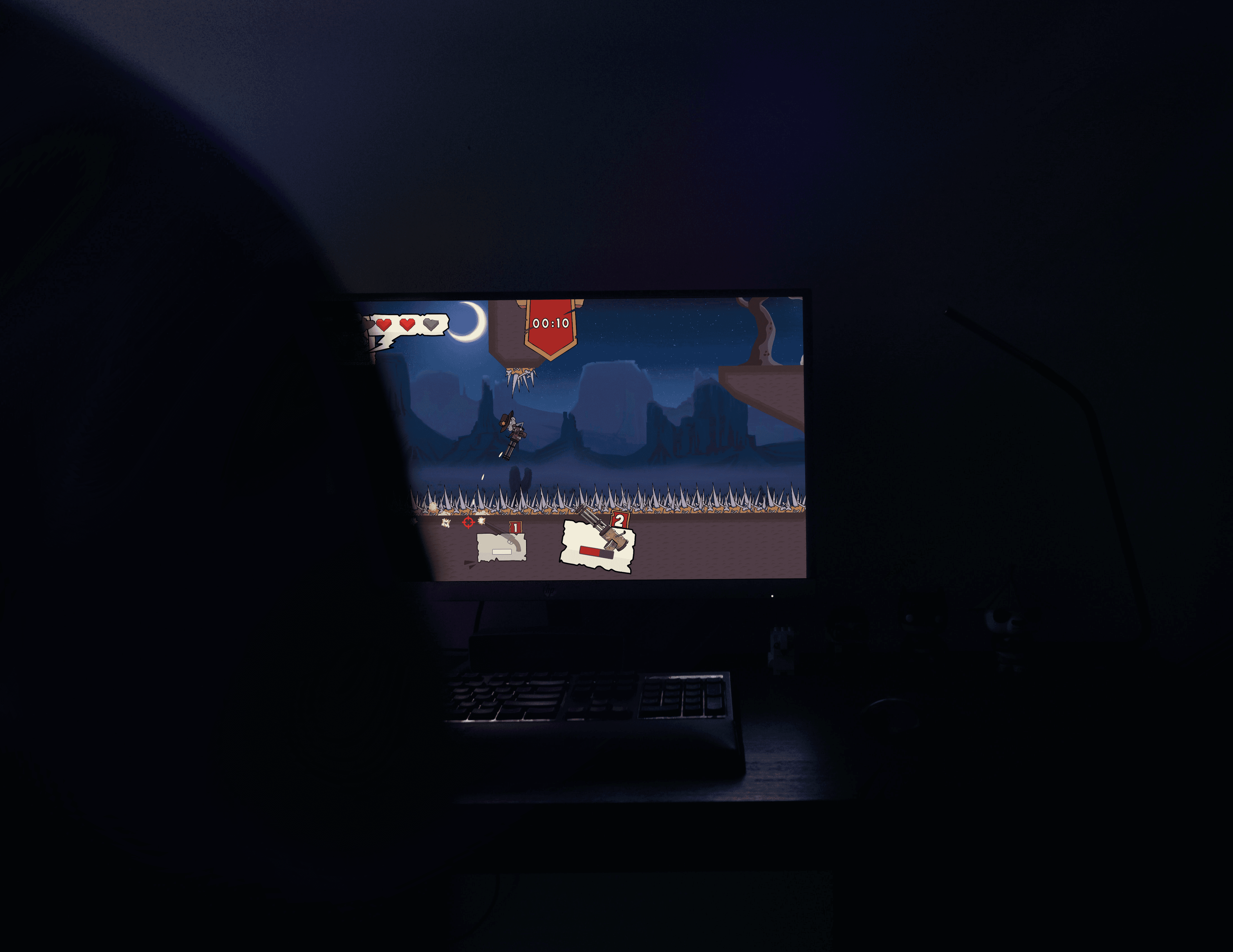
Player HUD
To maintain a highly focused gameplay experience, I designed a dynamic HUD that contextually surfaces information based on the player's immediate situation.
Applying principles of progressive disclosure, the interface actively hides empty weapon slots and removes the boss's health bar during standard exploration. This deliberate reduction of on-screen elements eliminates visual clutter, ensuring players only process the exact metrics they need to survive at any given moment.
Single Weapon Equipped | No Boss Encounter

Full Loadout Equipped | Boss Battle Active

Main Menu
To create a dynamic and connected interface, I engineered a custom "staging animation" system that ensures seamless, spatial transitions between main menu screens.
Rather than relying on traditional UI pop-ups, the background environment physically shifts in the direction of the user's selection. For instance, clicking "New Game" triggers a smooth camera movement to an entirely new scene for name entry, preserving narrative immersion and maintaining continuous user flow.
Main Menu UI Transitions
Main Menu UI System

Pause Menu
To provide a necessary cognitive break, I designed a context-aware pause menu that acts as a safe "stop point" for players during active gameplay.
The interface logic dynamically adjusts its layout based on the user's current in-game environment. For example, during active gameplay, the UI shows current level objectives and progression tracking. However, once the player returns to the safe hub world, the system intelligently simplifies the layout to display only essential controls.
Pause Menu | In-Game

Pause Menu | HUB-World

Pause Menu
Problem:
Placing level objectives directly on the HUD created unnecessary screen clutter that obstructed the player's field of view.
Because the core loop is fast-paced and requires constant attention from all angles, expecting users to read text while dodging obstacles broke immersion and led to a frustrating gameplay experience.
Solution:
To resolve this, I relocated all objective and progress tracking to the pause menu, providing a dedicated space for goal review.
Players can now halt the action and read their tasks clearly on a full screen without pressure or distraction, allowing them to return safely to the game without risking mid-level failure.
UI Draft with Quests on the side

HUB World
Note: This was my first time designing a hub world, which is pretty challenging.
My primary goal for the hub world was to keep the interface minimal, allowing the 3D environment itself to intuitively guide player interaction.
By deliberately stripping away traditional on-screen menus, users can freely explore the central space and test their weapons without visual distractions. This spatial design approach supports a deeply immersive experience while still ensuring clear, uninterrupted access to level selection.
HUB World Explore
Problem and Solution
Problem:
Placing the level objectives on the right side of the screen created an unbalanced composition.
While that is where most players naturally look, the early layout caused immediate gameplay issues. The "Wanted Sign" physically blocked the view of the next area, leaving half the interface cluttered and the other half entirely empty.
Solution:
Removing the "Wanted Sign" and moving the objectives to the top of the screen kept the right side clear for gameplay.
By removing the bulky side panel, this adjustment restores visual symmetry and completely clears the right-side viewing angle for active gameplay. The new top-aligned placement also introduces polished transition animations that enhance the interface's overall flow without getting in the player's way.
HUB World | First ALPHA Draft

HUB World | Final

Impact
Breaking down long lists into individual, animated boxes made objective information 34% faster to read and process, as confirmed by player behavior tracking during the Beta phase.
Adding smooth dropdown animations made the interface feel much more responsive and high-quality.
Impact
Breaking down long lists into individual, animated boxes made objective information 34% faster to read and process, as confirmed by player behavior tracking during the Beta phase.
Adding smooth dropdown animations made the interface feel much more responsive and high-quality.
Impact
Breaking down long lists into individual, animated boxes made objective information 34% faster to read and process, as confirmed by player behavior tracking during the Beta phase.
Adding smooth dropdown animations made the interface feel much more responsive and high-quality.
UI Assets
To establish a cohesive visual identity, I developed a comic-inspired UI asset system featuring dynamic layouts that perfectly match the game's playful, fast-paced tone.
By utilizing bold color palettes, thick outlines, and panel-driven structures, the interface components are crafted to feel alive and visually engaging. This aesthetic approach strictly reinforces the project's overall personality while rigorously maintaining high clarity and readability across all screens and menus.
UI Assets I Designed and Drew
