What I Learned
This project gave me my first experience conducting research with direct community stakes.
The Road Home's website isn't a commercial product, but infrastructure for people navigating crisis. That shifted how I thought about every recommendation: the cost of a confusing label isn't a lower conversion rate, it's a person giving up on finding shelter.
A single ambiguous label can block an entire user journey — not because the interface is broken, but because users won't investigate something they don't recognize.
This project also taught me to be honest about the limits of my participant sample. Our Spanish-language scenario was completed mostly by English-primary speakers simulating a language barrier — not people with a genuine need.
Participant Demographics
20
Total Participants
[Desktop & Mobile]
21
Asynchronous Tree Test
Methodology
Moderated Usability Testing With Think-aloud Protocol
Each participant completed six realistic scenarios while narrating their thought process aloud. We observed 15 desktop participants and 5 mobile participants in live sessions. The think-aloud protocol surfaced mental models and moments of confusion that click data alone would have missed, for example, participants who silently gave up rather than voicing frustration.
Post-task Survey
After each scenario, participants rated: how long the task took relative to expectations, task difficulty on a 1–5 scale, whether they found the information they needed, and what information they expected but couldn't locate. This per-task data let us compare friction levels across different parts of the site.
Product Reaction Cards (Microsoft)
After completing all scenarios, participants selected 3–5 words from a standardized set to describe the overall website experience. This gave us a structured way to quantify sentiment.
Most Selected Positive Words
"clean" (10 Vote)
"valuable" (8 Vote)
"helpful" (7 Vote).
Most Selected Negative Words
"frustrating" (3 Vote)
"time-consuming" (3 Vote)
"overwhelming" (2 Vote)
System Usability Scale (SUS)
Every participant completed the 10-item SUS questionnaire after testing. The SUS produces a score from 0 to 100, with 68 as the established industry average. The Road Home scored an above-average 75.2. This indicates that the site's core architecture is solid and that problems are concentrated in specific labeling and accessibility gaps rather than fundamental structure.
Tree Testing (Optimal Workshop)
21 additional participants completed asynchronous tree tests, navigating a text-only version of the site's menu structure to find answers to 5 tasks. This isolated information architecture from visual design, letting us determine whether navigation labels were the source of confusion rather than layout or aesthetics.
Navigation was Reliable Across Devices
On desktop, every participant instinctively used the top navigation bar. The Road Home logo functioned as a reliable home button. Nearly all participants used it to return to the homepage between scenarios. On mobile, all 5 participants across ages 20 to 53 immediately used the hamburger menu, and 20 of 37 first-click instances on mobile were the collapsed menu icon.
Employment Information was the Easiest Task
The existing employment pop-up, which appears on the homepage, proved to be an effective shortcut that helped participants reach job applications in significantly fewer clicks.
Monetary Donations were Highly Findable
Every single tree test participant successfully located a path to make a monetary donation. On desktop, 8 of 13 moderated participants found the donation page in a single click.
Overall Usability was Above Average
A SUS score of 75.2 tells a specific story: the site's core architecture is solid, and most people would learn it quickly. The problems we found were concentrated in specific labeling and accessibility gaps rather than fundamental structure.
Problem:
A Jargon Label and a Visual Hierarchy
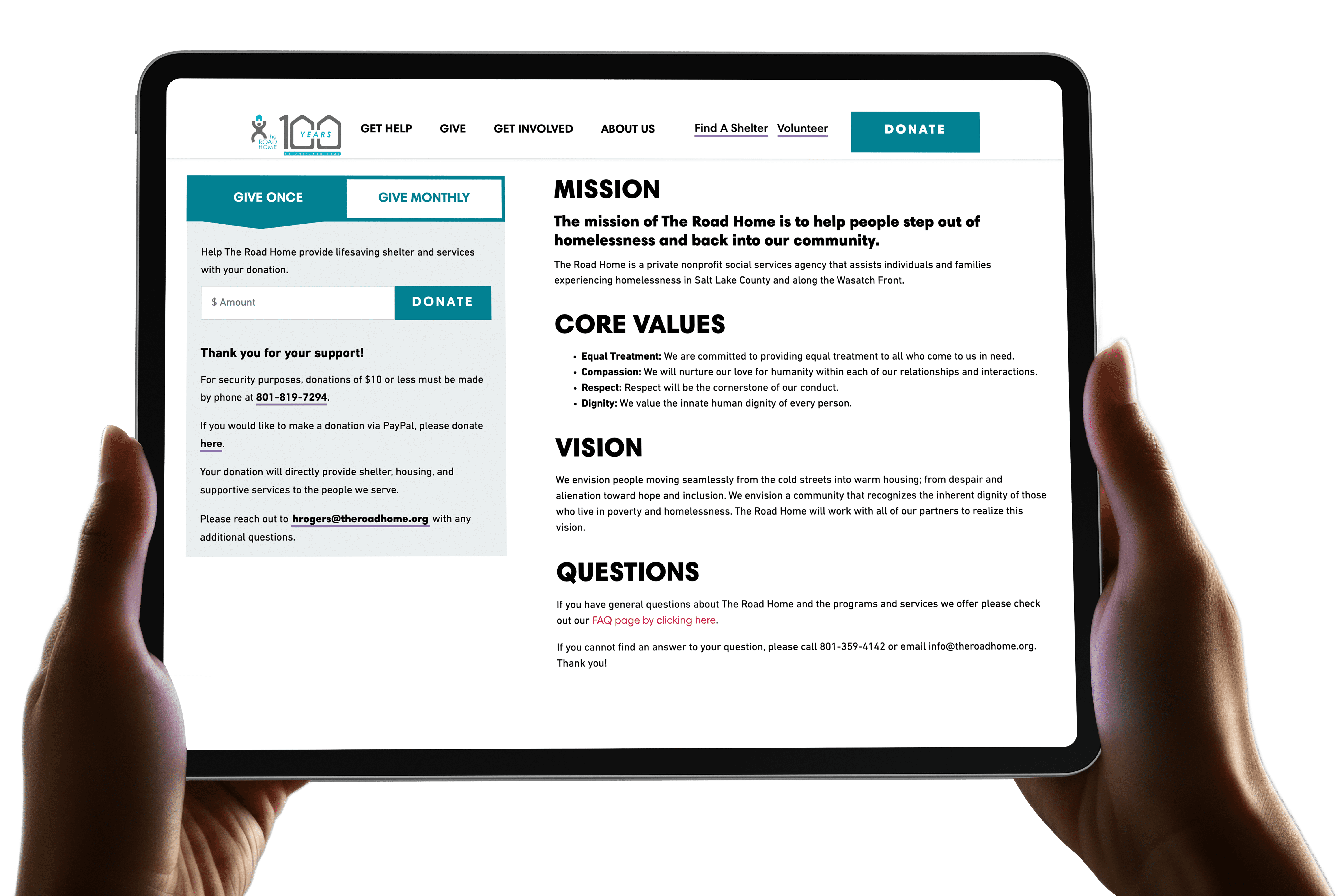
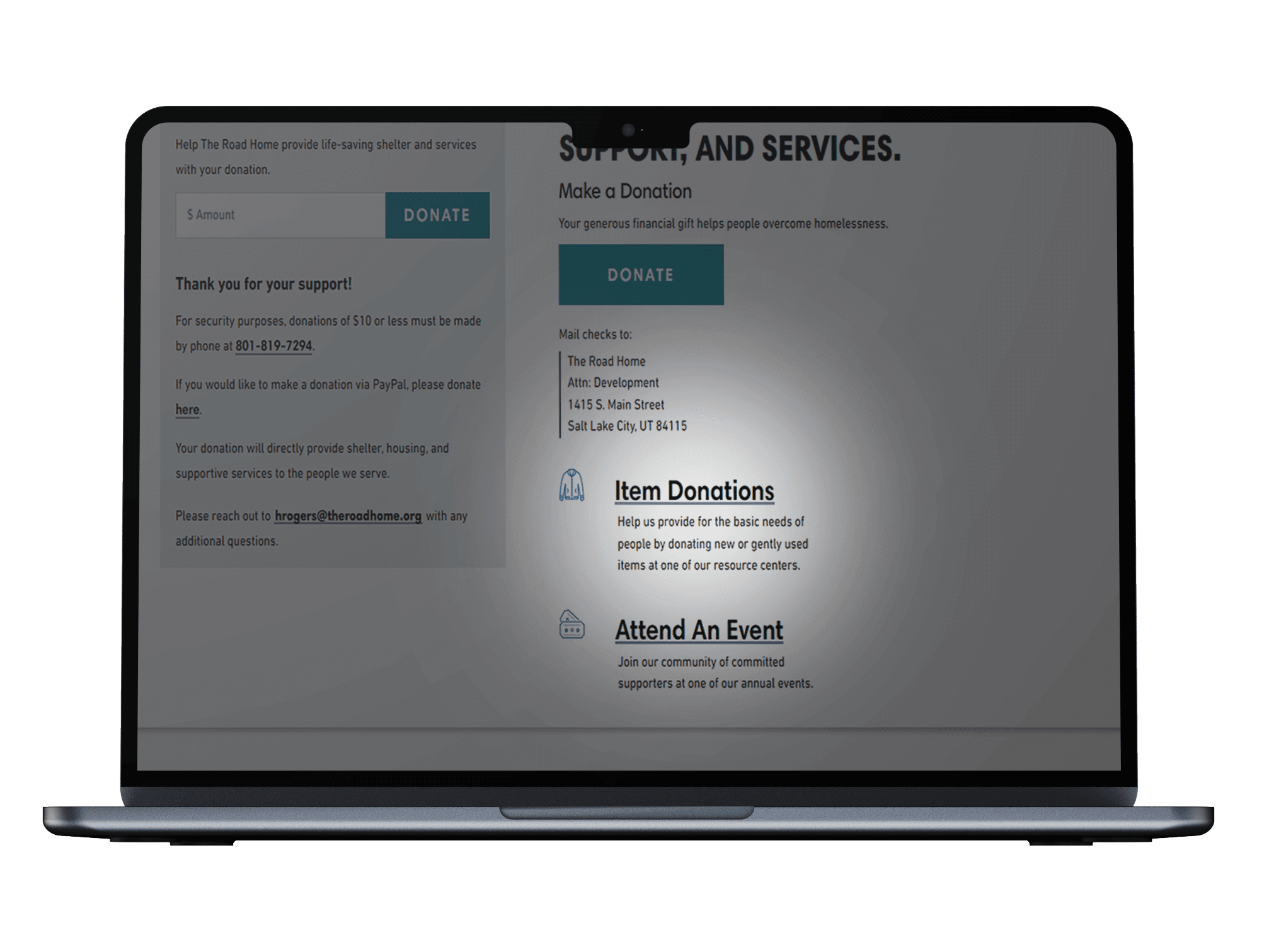
Issue Blocked Item Donations
Our Observed
Our Solution
We addressed both layers of the problem by switching to plain language and fixing the icon's visual weight.
We recommended replaced "In-Kind" with "Item Donations" throughout the site to match how users already think about giving goods. I also resized and regrouped the icon to match the surrounding donation options, ensuring the section stops disappearing into the page.
Before
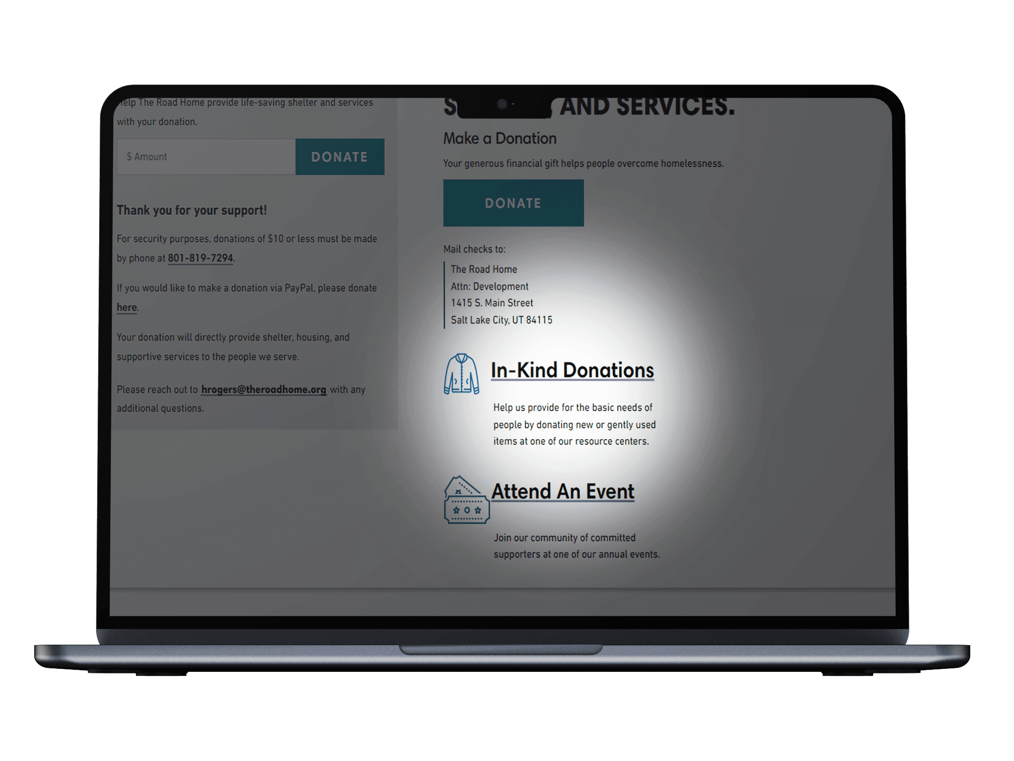
After
Impact
Following implementation, a Road Home team member reported that donation-related phone inquiries dropped by more than half. This was completely consistent with our finding that the majority of participants failed to self-serve this information during testing
Problem:
Spanish-Speaking Visitors Had
No Path Forward
Our Observed
Every participant failed the Spanish-language scenario because the site lacked any discoverable translation features.
Mobile participants rated it the hardest scenario of the study, averaging 4.8 out of 5 for difficulty. Desktop participants rated it 3.9 out of 5. Participants who needed Spanish exhausted every available menu before giving up. One said: "I'm just going through all the options here to see if I can find anything." The consistent fallback was to call the organization by phone, placing the burden of accessibility on staff rather than the site.
Our Solution
We leveraged behavioral data to strategically position a language toggle and provided the client with three actionable, budget-friendly implementation paths.
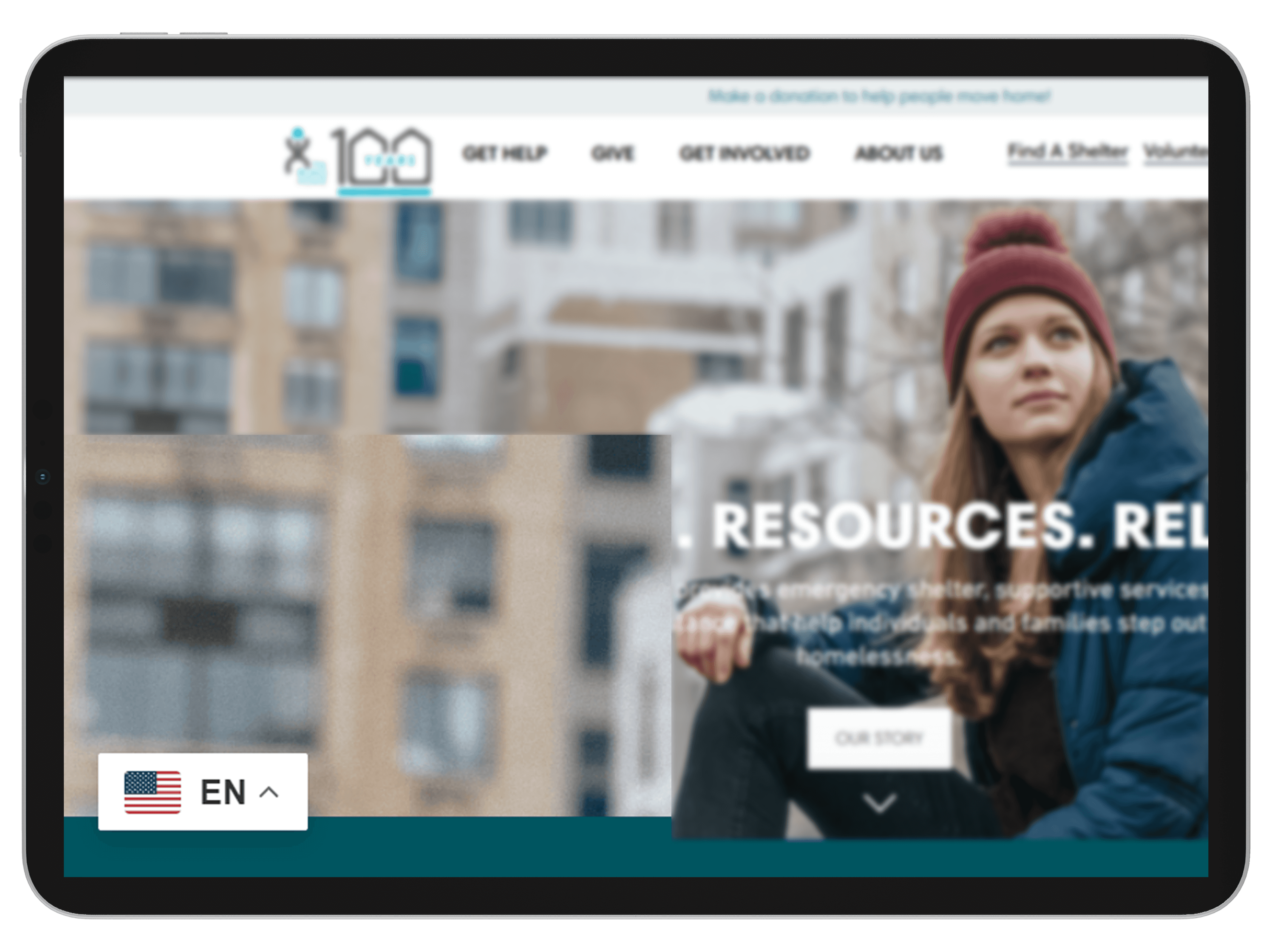
Think-aloud sessions and behavioral observation showed that when participants looked for a language option, they scanned the top right of the page first, followed by the bottom left. Based on this, our team recommended placing the language button there for better visibility and accessibility. To meet their technical constraints, we researched solutions used by comparable Utah nonprofits: a custom-coded bilingual site, a WordPress translation plugin, and the Google Translate plugin.
Official Language Button
What I'd Do Differently
To capture genuine urgency data, I would conduct a follow-up study exclusively with native Spanish speakers.
Because our initial participants were primarily English speakers navigating a simulated scenario, testing with users who actually experience this linguistic barrier would produce much stronger, validated findings for our recommendations.
Problem:
A Useful Pop-up Became an
Obstacle Through Repetition
Our Observed
The homepage employment pop-up successfully accelerated navigation but aggressively reappeared every time a user returned to the main screen.
Testing showed the initial feature worked incredibly well, letting participants reach job listings in three steps instead of six. The issue was that the website did not remember when a user dismissed the window. Forcing visitors to repeatedly close the same box ruined the experience, with testers calling it "a little annoying" and comparing it to an unwanted ad.
Our Solution
We kept the highly effective design exactly the same but updated the system to track and remember when a user closes the window.
Since the content and placement were already proving valuable, we only changed how the website handles the interaction. We made sure the pop-up stays hidden for the rest of the session once dismissed, and we added a "Don't show this again" toggle for returning visitors.
Problem:
Detailed Shelter Information
Was Buried on a Page No One Found
Our Observed
Every participant missed critical shelter instructions because the detailed resource page was nested under an unintuitive navigation menu.
When looking for assistance, users naturally clicked "Get Help" and stopped searching. Unfortunately, the more comprehensive "Emergency Shelter Resource Centers" page was hidden under the "About Us" tab, meaning absolutely no one visited it during testing. This setup made essential details like required check-in documents effectively invisible. Furthermore, both pages shared an identical layout, making the duplicated content confusing and hard to justify.
Our Solution
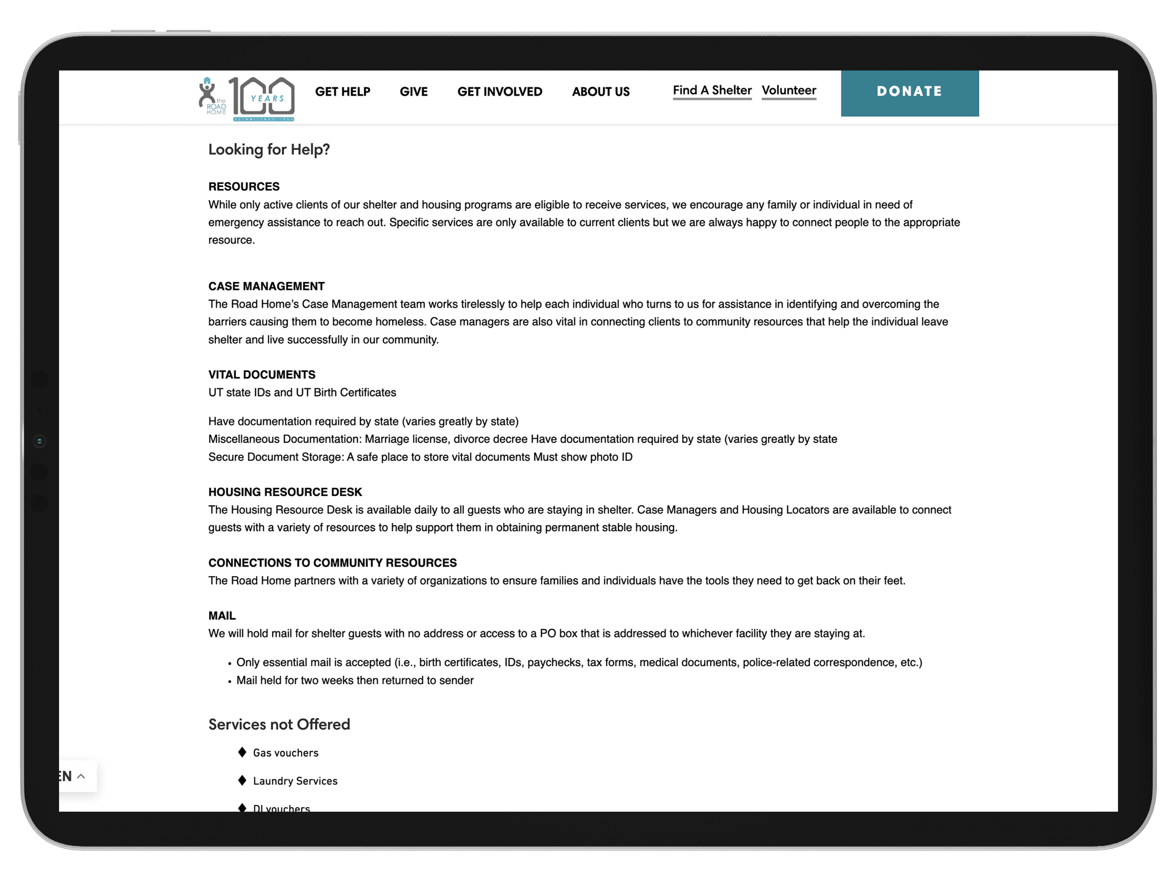
We merged the two identical pages to consolidate all housing resources into the exact location users naturally expect to find them.
Since testing proved visitors consistently land on the "Get Help" screen first, we moved all the "More Info" links and mandatory document requirements directly to that page. This restructuring gives users everything they need immediately and completely removes the burden of forcing them to discover a hidden secondary tab.
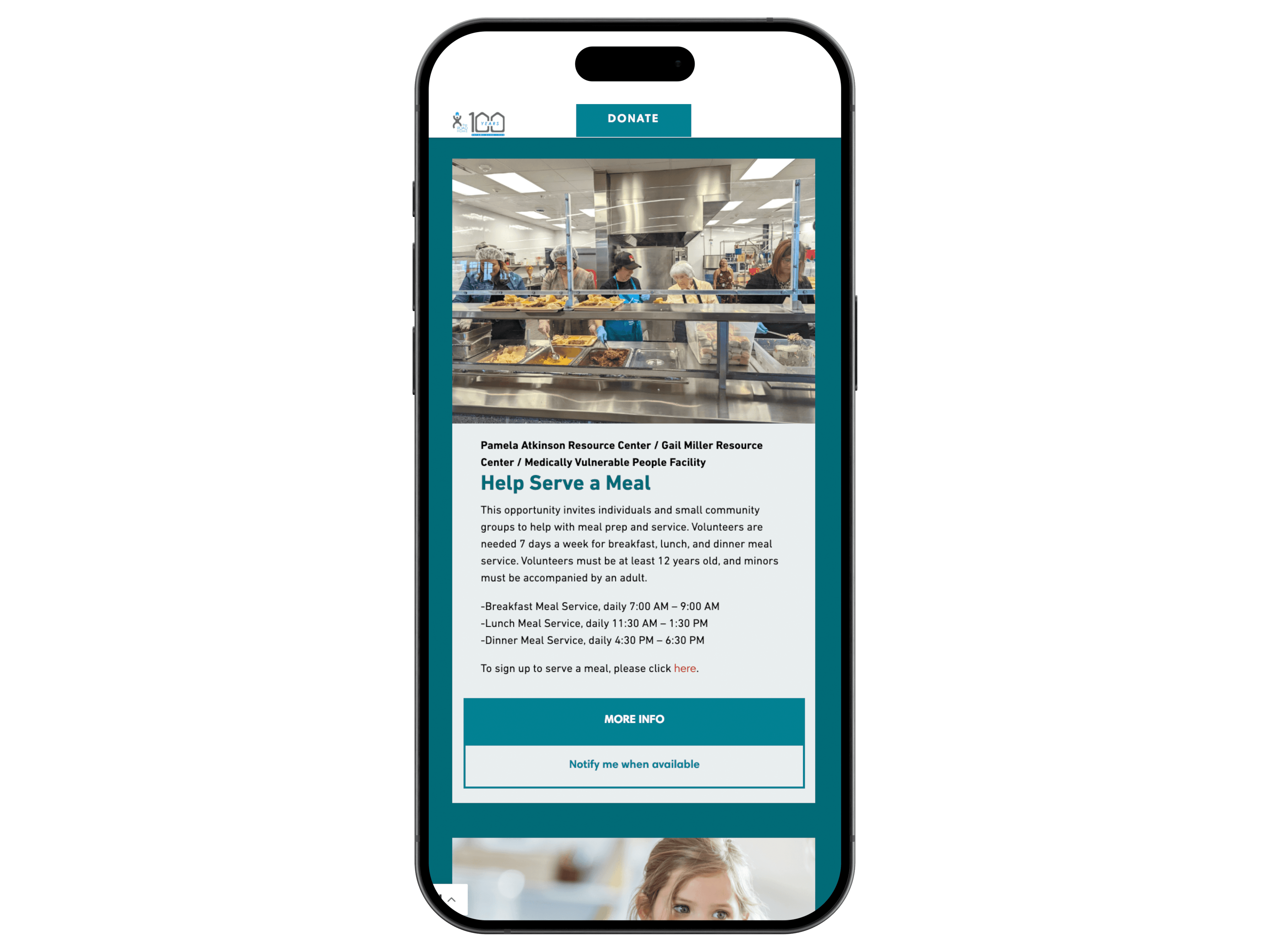
Critical Informations Page
Problem:
On-Hold Programs Set Up an Expectation the Site Couldn't Fulfill
Our Observed
The sign-up flow was easy to locate but failed users by keeping interactive buttons active for programs that were actually on hold.
Desktop participants gave the initial discovery process a highly successful 1.3 out of 5 difficulty rating. However, they quickly encountered severe friction when exploring specific initiatives like Literacy Night or the Palmer Court Pantry. Clicking "Sign Up" on these unavailable programs triggered a silent redirect to the top of the page with absolutely no error message or explanation. This interaction read as a technical bug rather than an intentional paused state.
Our Solution
We proposed two distinct UI updates to eliminate the silent redirect and clearly communicate program availability to the user.
Based on the organization's preference, they could either visually disable and gray out the element to make the inactive state immediately obvious. Alternatively, they could change the text to "Notify Me When Available." This second option successfully retains user interest for the future without falsely implying the event is currently open for registration.
Notify Me When Available Button