CLIENT's testimonial:

Maggie Bunnag
Restaurant Owner
Beside his hard working, he is a very detailed person. When he built the Naraya website, he asked me if he can ask random customer that come to our restaurant to test the new website. The result come out as majority of the customers love the design and how easy to navigate especially compare to our old Sawadee website. He also setup a system that allow us to easily edit content, such as price or food name, from one single page without having to go through every page.
I can guarantee as a business owner for knowing him for almost 2 years that no matter what problem or how hard the obstacle he faces, he will go through those obstacle and go above and beyond.
Staff Insights
Conducted stakeholder interviews with servers to identify common guest questions and information gaps on the existing site. I used this data to pinpoint exactly what users were struggling to locate.
Customer Behavior
Mapped the User Journey to understand local guest behavior. This allowed me to prioritize high-value information, ensuring a frictionless path for guests to complete their booking or order.
The Outcome
Architected a User-Centric Information Architecture (IA) that addresses previous usability issues. The new structure streamlines the booking process, making it significantly faster for the user.
Participant Demographics
11
Total Participants
[4 Staff & 7 Customer]
79%
Accessed via Mobile
21%
Accessed via Desktop
Methodology
Task-Based Testing
To observe behavior. It reveals if the navigation actually work when a user is trying to accomplish a real task.
The Five-Second Testing
To measure first impressions and visual hierarchy.
Post-Task Survey
To capture subjective feedback and pain points.
Example of Survey & Interview Questions


Problem
Low Discoverability
Users missed primary CTAs (Calls-To-Action) because buttons lacked clear visual affordance.
Solution
Reduced Friction
Integrated the Toast POS and restructured the User Flow to bypass unnecessary steps, allowing guests to get straight to the action.
Visual Consistency
Established a Unified Design System to ensure all interactive elements have a consistent look, making it clear what is "clickable.
Impact
Feature Awareness
After the redesign, discoverability jumped to 92%. Users were able to identify and interact with all important action buttons in under 5 seconds.
Before

After

Problem
Readability Failure
Users found the interface nearly impossible to read quickly.
Solution
WCAG 2.1 Contrast Standards
Conducted an Accessibility Audit and updated the color system to meet WCAG 2.1 contrast standards.
Optimized Typography
Swapped to a high-legibility typeface that keeps the "fine-dining" feel while staying clean on mobile screens.
Impact
Instant Recognition
Usability testing confirmed that guests can now scan and understand key information in under 5 seconds.
Before (About Us Section)

After (About Us Section)

Problem
Brand Misalignment
Users described the legacy design as "budget" or "unpolished."
Solution
Parallax Scrolling
Implemented parallax scrolling to naturally guide users toward the awards and restaurant highlights.
Visual Consistency & Responsive
Established a Unified Design System to ensure a high-end, "fine-dining" aesthetic remained consistent across all device types.
Impact
Aesthetic Preference
Participants found the new interface significantly more credible and representative of a fine-dining experience.
Before (Award Section)

After (Award Section)
Problem
Information Blindness
Users were unaware that "Pickup" was an option.
Additionally, staff interviews revealed that guests frequently arrived at the wrong location or during restaurant break times due to unclear operational data.
Solution
Early Decision Point
Moved the service selection (Delivery vs. Pickup) to the very first screen to set expectations immediately.
Operational Transparency
Implemented clear "Live Status" hours and a Direct-to-Map feature. This ensures guests know exactly when and where to go before they start their order.
Impact
Task Success Rate
Users confidently identify the correct location and fulfillment method from the start of their journey.
Before (Online Order Tab)

After (Online Order)
Problem
High-friction booking
To book catering, users were forced to leave the site to call or email. This broken user journey created high friction and caused many potential customers to quit.
Solution
Integrated Booking Form
Built a one-stop form to collect dates, guest counts, and dietary needs directly on the site.
Workflow Efficiency
Shifted manual inquiries to a digital queue, allowing the owner to manage requests efficiently without interrupting busy dinner shifts.
Impact
Booking Growth
and reducing the time spent on manual follow-up calls by 40%
Before (Catering Section)

After (Catering Section)

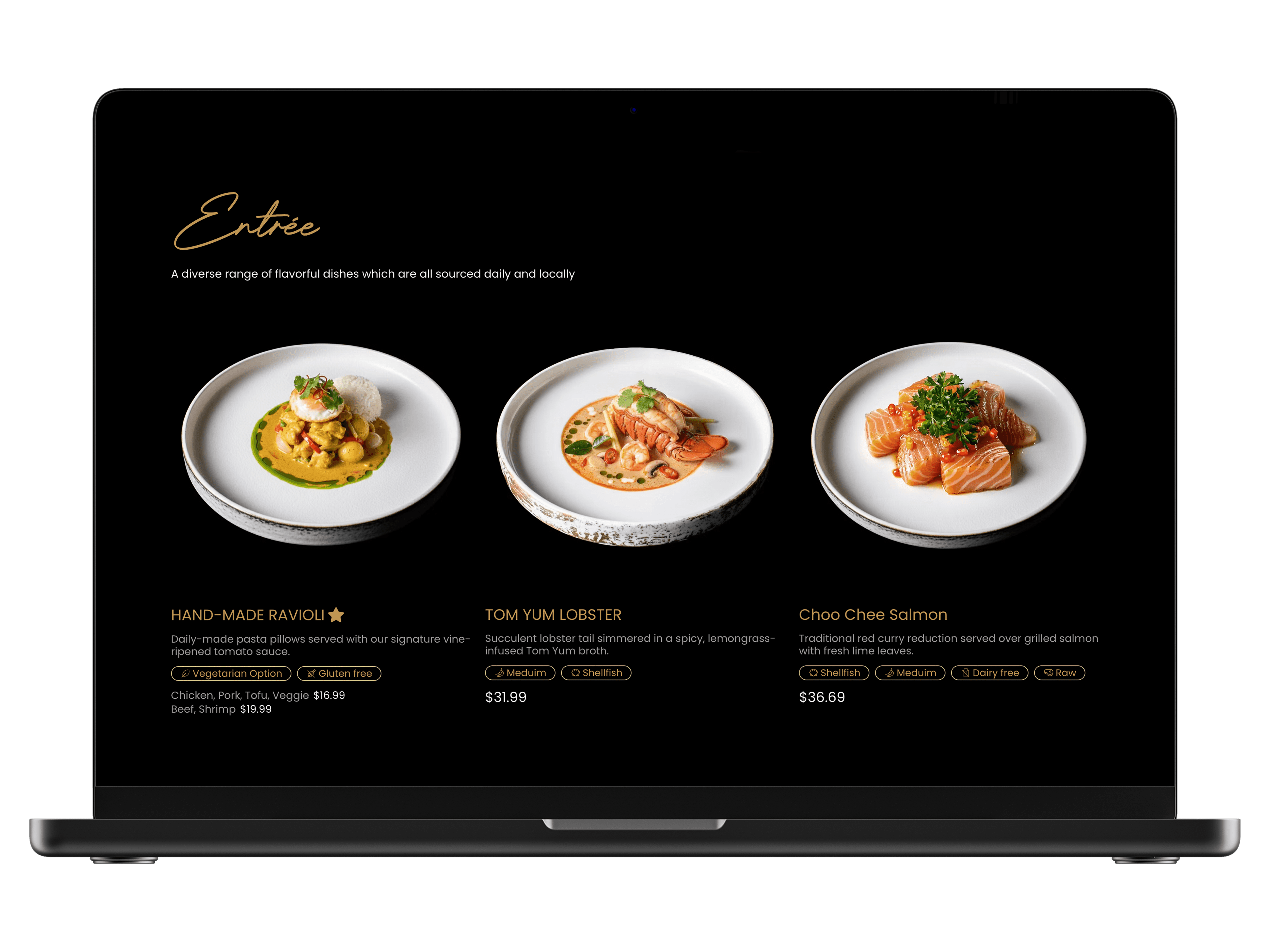
Problem
Inventory Misalignment
Users struggled with a menu that was difficult to navigate and frequently out-of-stock. This caused guest frustration and high order-correction rates for the staff.
Solution
Real-time Availability
Added a toggle for managers to instantly hide or show specific items, sections, or entire seasonal menus.
Dietary Labels
Integrated clear dietary labels (GF, Vegan) to support user decision-making and reduce the need for verbal staff explanations.
Layout Flexibility
Designed five modular layout presets, allowing the brand to update seasonal menus while maintaining a premium aesthetic.
Impact
Reduction in Ordering Friction
Staff reported a significantly lower "explanation load" during peak hours, ensuring guests only see what is currently available.
Before

After
Before

After


Take Away DEsign


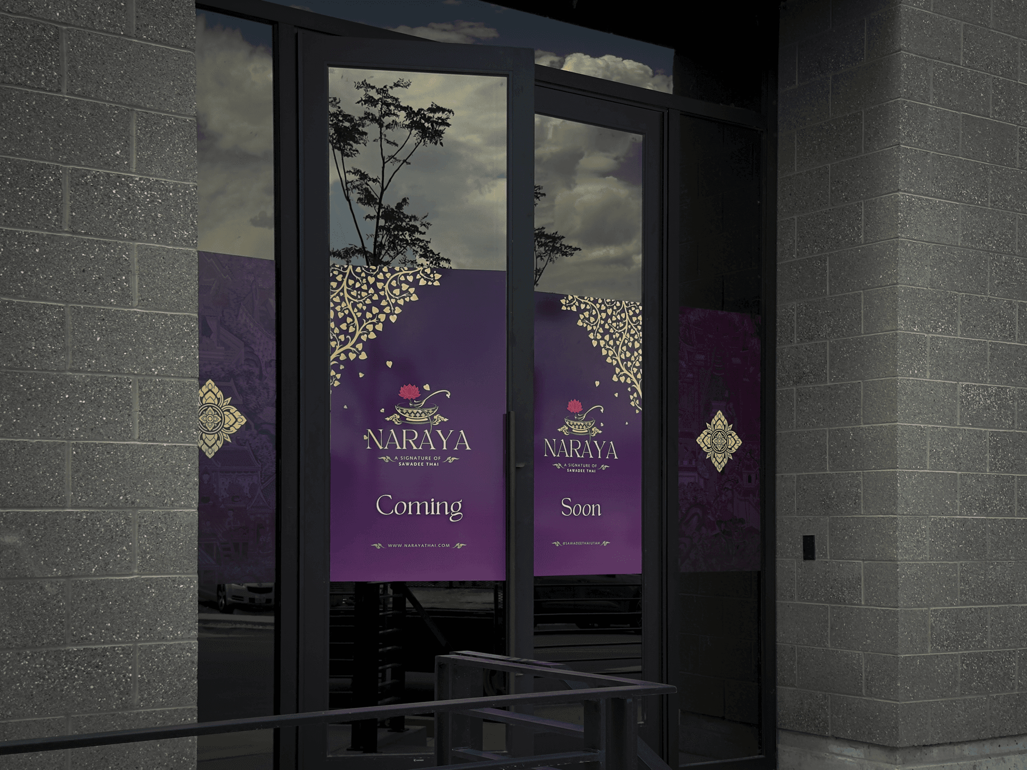
Window Decal Design