Event Achievement
The event will be re-launched every year as an annual event.
Increase 42.6% Revenue
(Compared with events in the same category).
Proud Story
During my internship, I pitched an original revenue event that was not part of the initial ideation pool and guided it to launch.
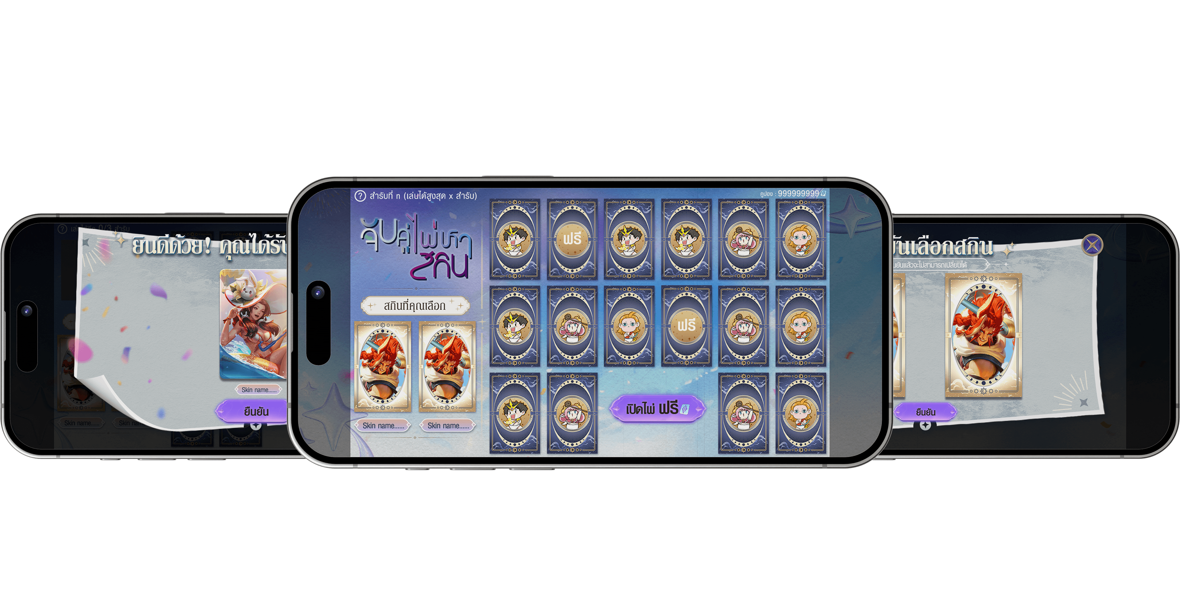
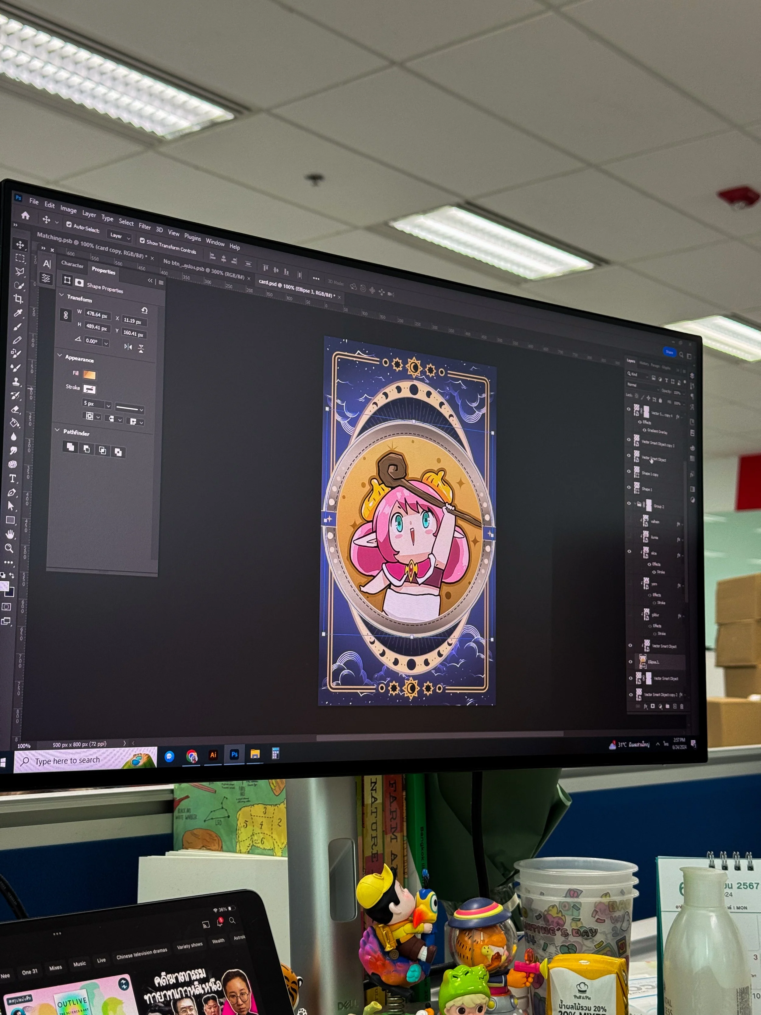
I managed the Matching Cards Project from the initial pitch to production, balancing visual UI, interaction logic, and revenue modeling to ensure the game was both engaging for players and profitable for the business.
Moving this game into live production was a deeply collaborative effort. The final outcome would not have been possible without the hard work of our excellent engineering team and the invaluable support and expertise of my mentor, P'Vee.
Events Details
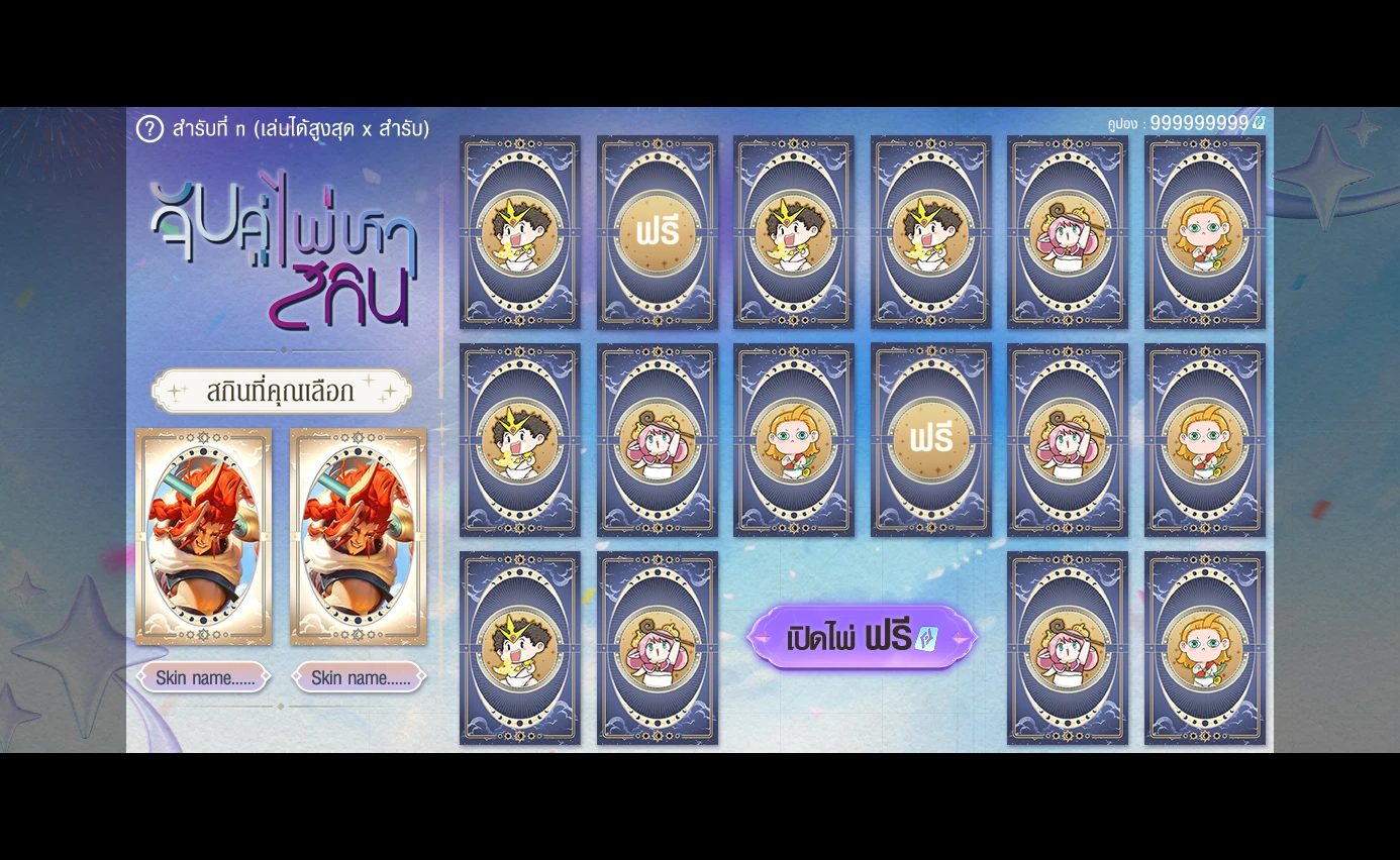
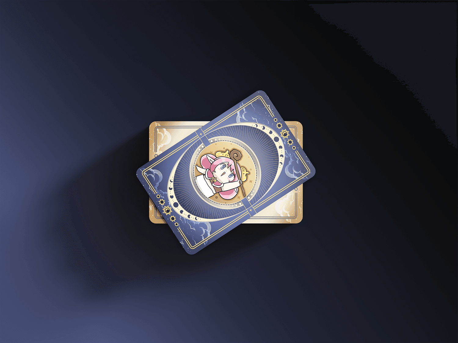
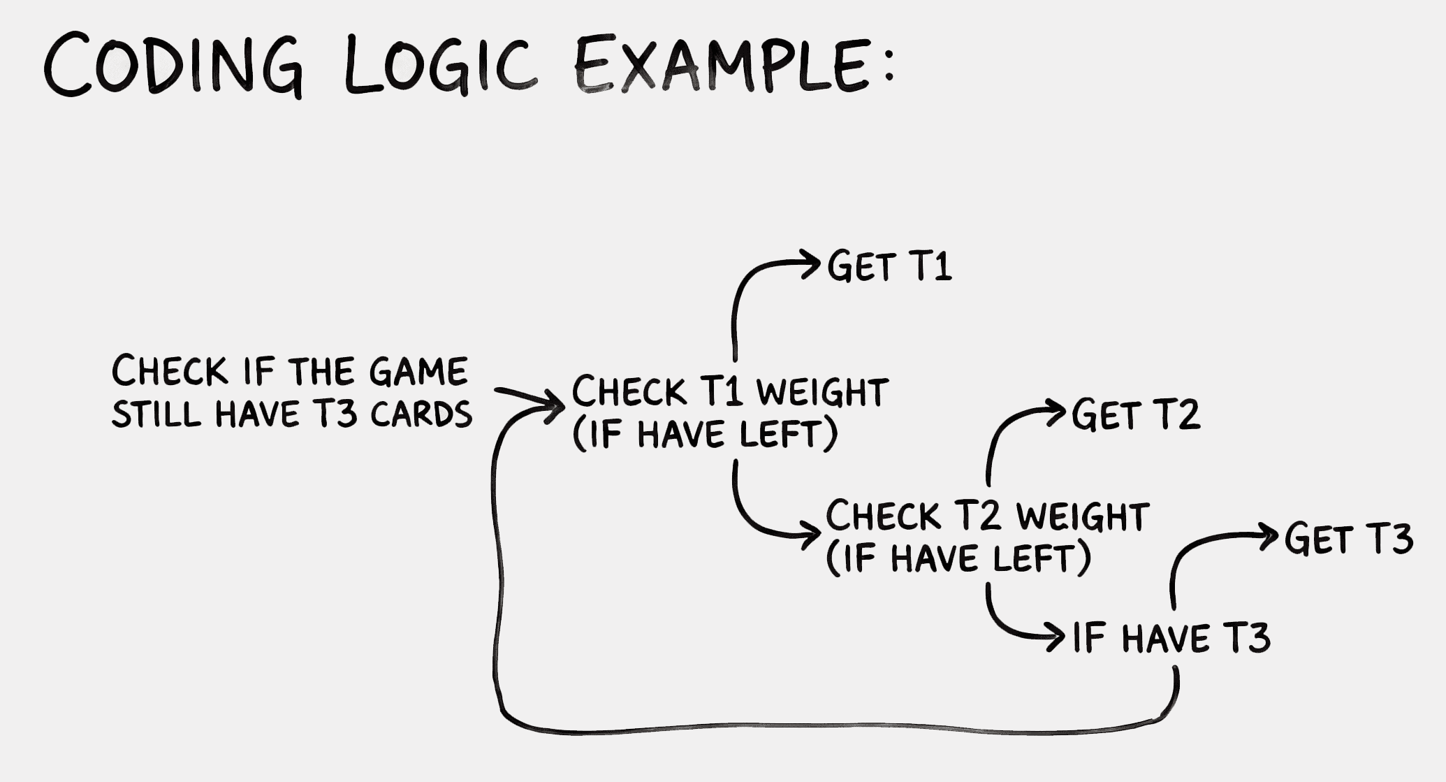
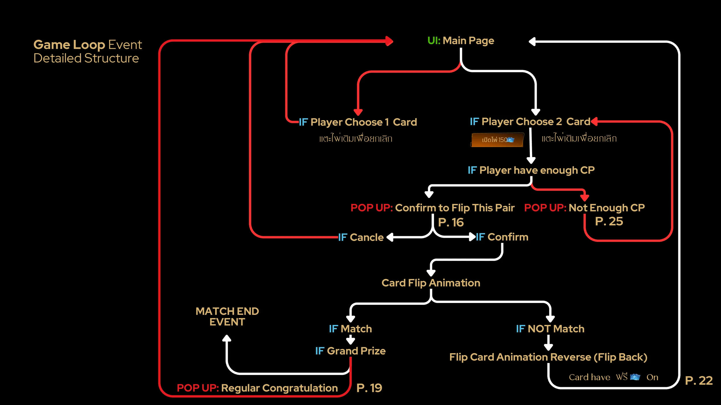
In this game, players match cards with identical faces. Cards that have not been flipped will be labeled as "blank," allowing the system to determine their faces.
However, once a player has flipped a card, it will retain the same face to make the player feel less randomness (gacha-like game) in the event. If a player unveils a non-matching card, it will return to a face-down position, and its face will not change when unveiled again.
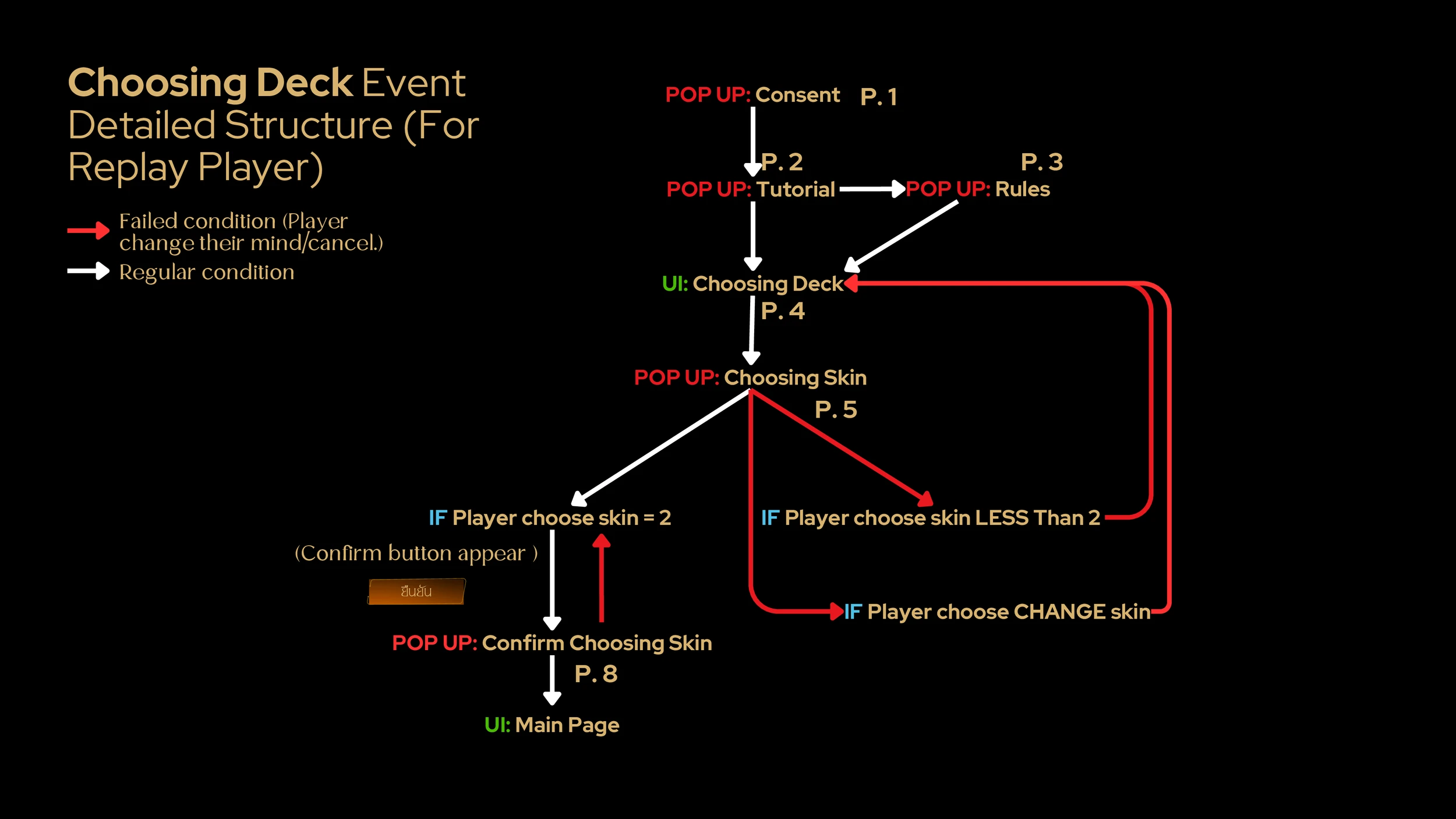
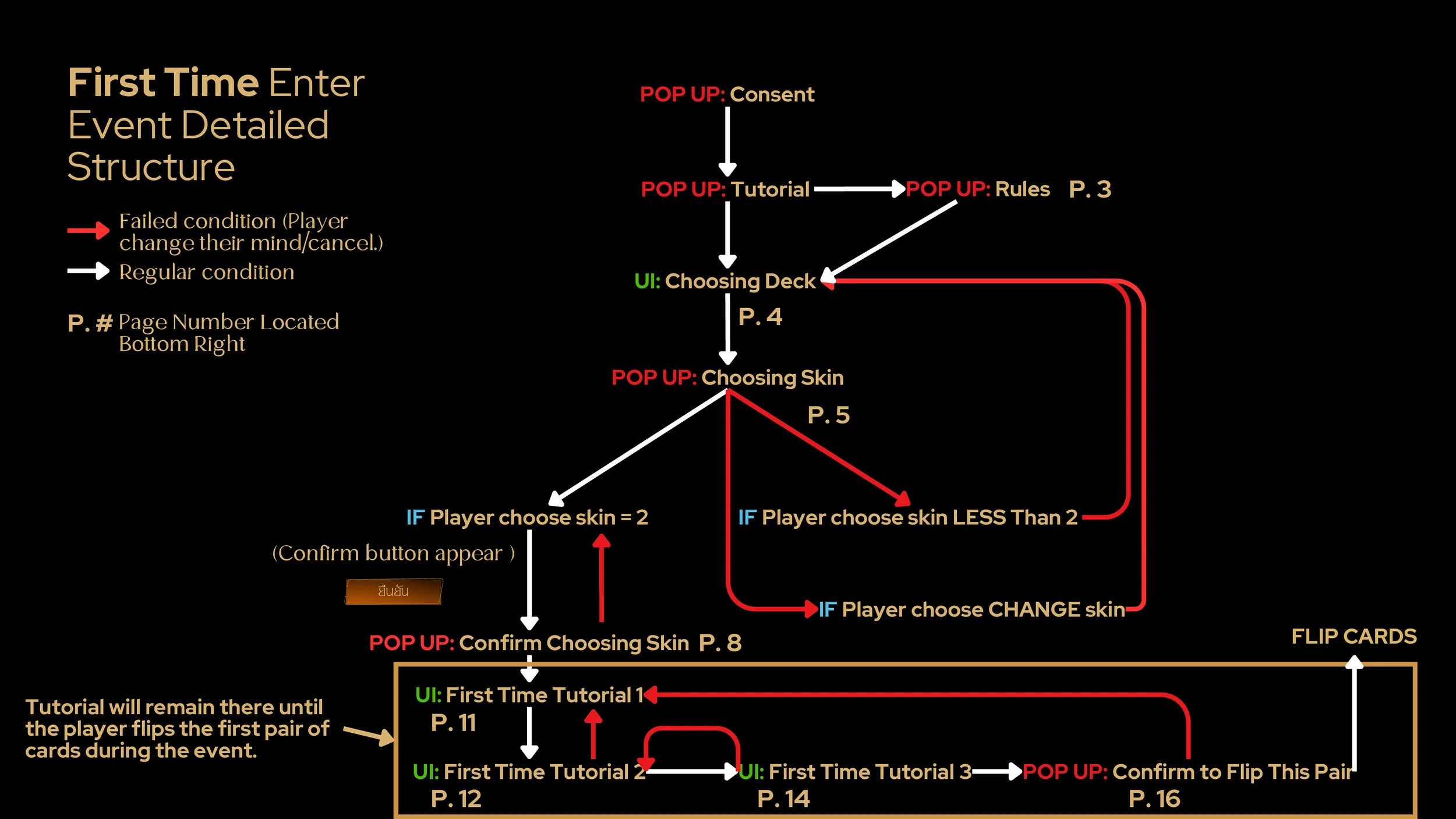
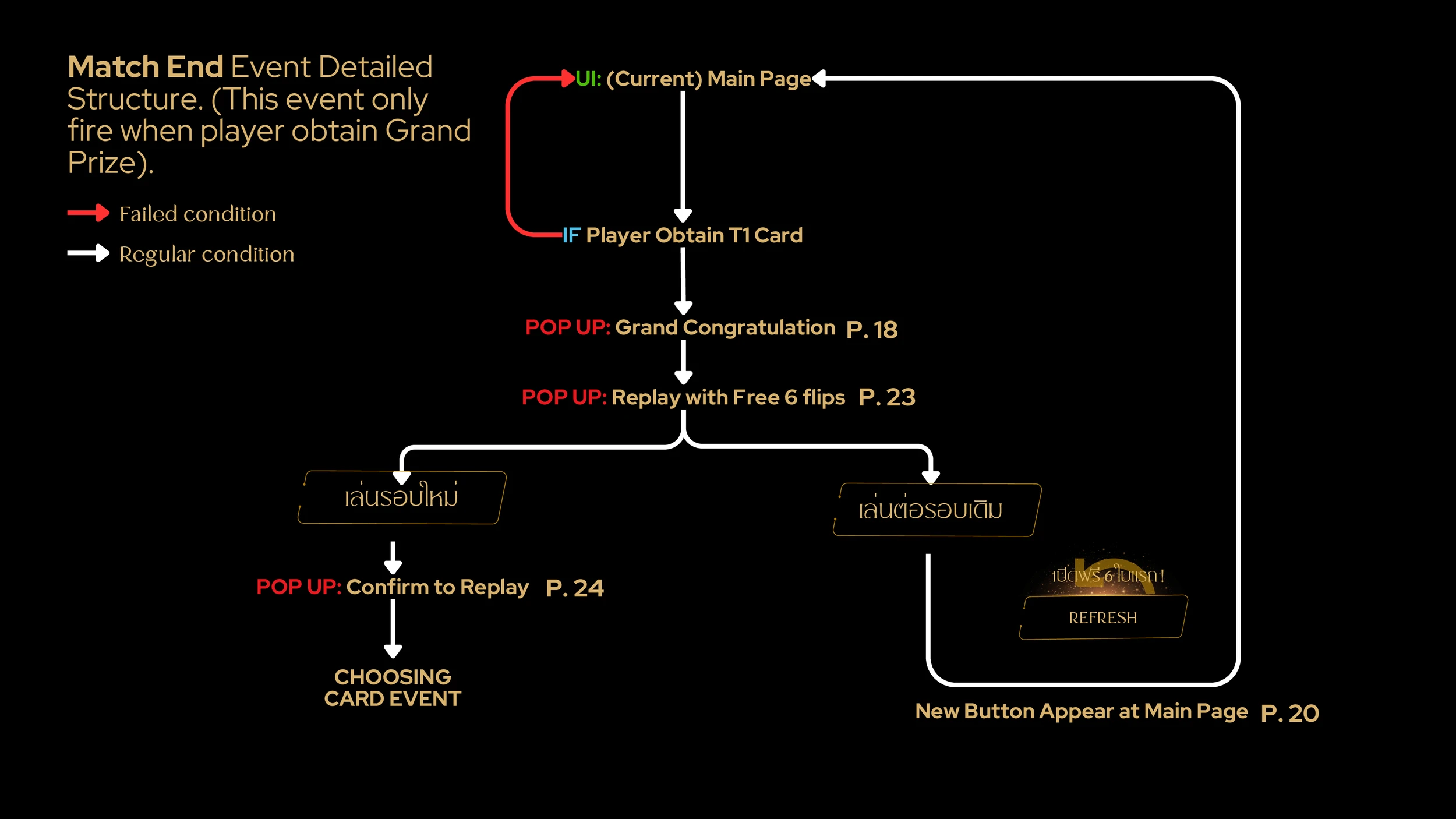
[Event Userflow]
Problem & Solution
Problem
Lack of Historical Benchmarks
While the company has robust tracking, there was no data for this specific event type to identify the optimal price point. Without knowing the "Churn Threshold" (the exact moment a player stops being willing to pay for a card flip) it was impossible to maximize the event's revenue potential.
Solution
Scalable & Adaptive Systems
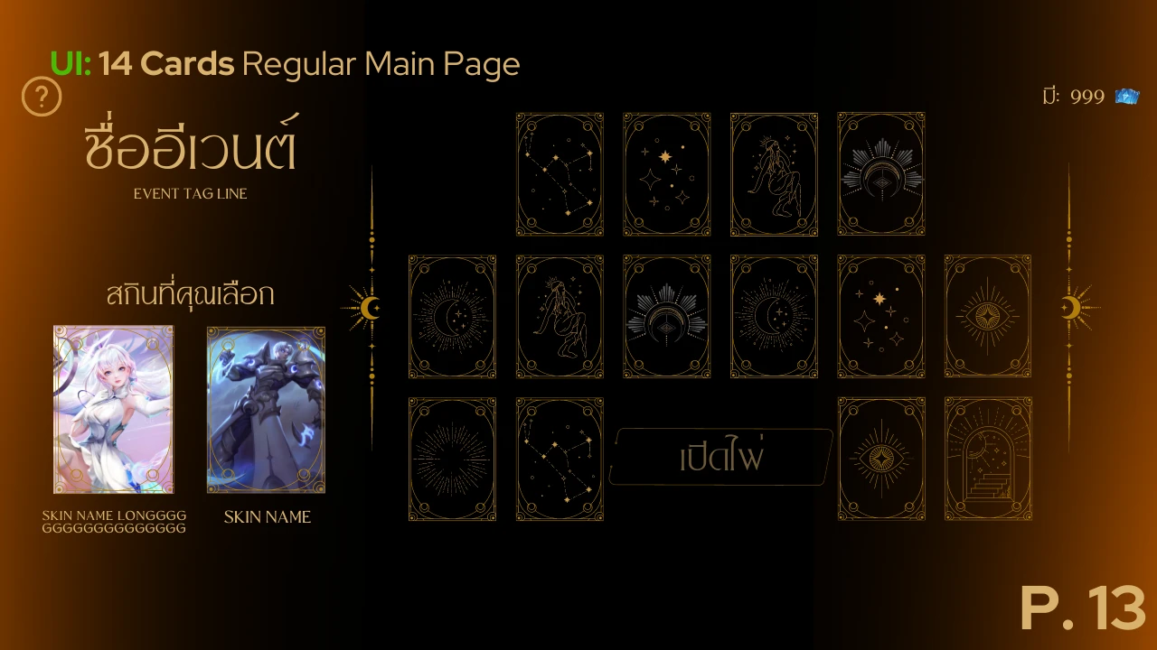
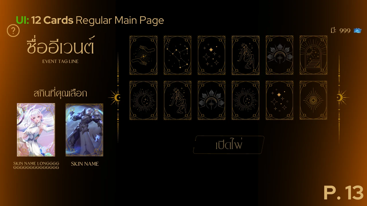
I designed 3 different layout versions and adjustable settings. This allows the company to easily relaunch the event or change the difficulty without needing to start from scratch.
By tracking how different user groups (A1–A4)* behave, I provided the company with the data needed to balance player motivation with revenue for future events.
Note: User segments A1–A4 are categorized by spending habits and activity levels. Specific names have been anonymized to comply with confidentiality (NDA).
14 Cards Layout Draft
12 Cards Layout Draft
Problem
Device Accessibility Gap
High card density and visual clutter made the interface nearly unusable on smaller mobile devices. This created a high risk of mis-clicks and frustrated users on non-premium devices.
Solution
Re-architected The Layout From Scratch
Since reducing the number of cards wasn’t viable, as it would affect both revenue and perceived reward value. So I reframing the problem around screen-space constraints and system-imposed "dead space," I implemented a horizontal configuration centered around a primary "flip" action. This optimized visual balance while increasing touch-target sizes, ensuring a high-legibility, accessible experience for all mobile viewports.
First Draft
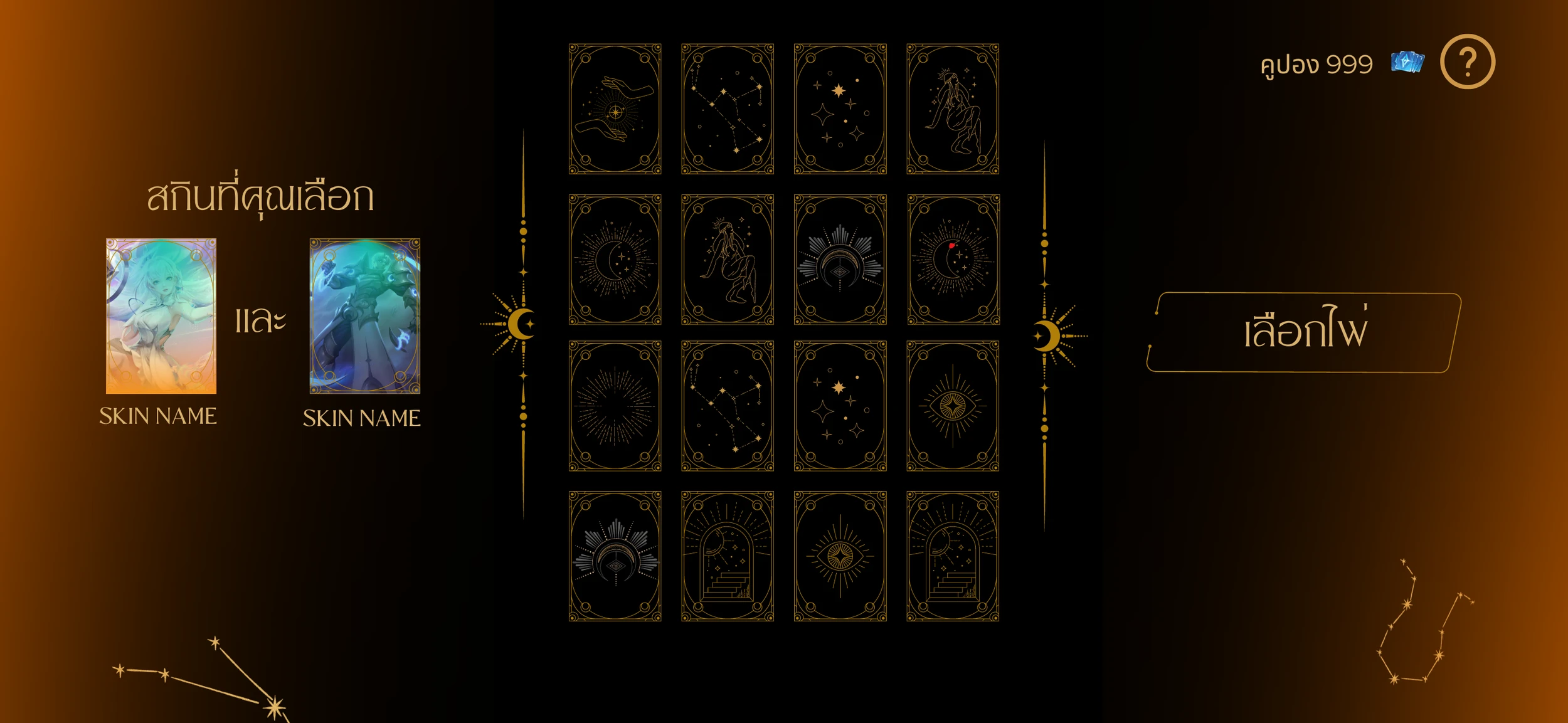
Final Draft